A big brand also for a small display
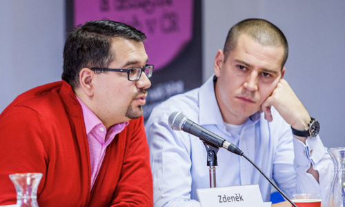
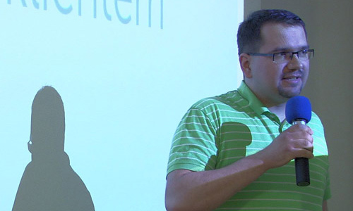
In October, a meeting of entrepreneurs took place at DAMI, and Zdeněk took part in one of the presentations. You can see it recorded here.
In October, a meeting of entrepreneurs took place at DAMI, and Zdeněk took part in one of the presentations. You can see it recorded here.
The interview that Zdeněk gave to Monica Kvapilová on her program MoniOnAir has just been published. A BRAND IS NOT A LOGO, BUT A STRATEGY
Today, together with the client, we presented a new project at a press conference. No wonder it received a media response. We will omit the political ones, we are interested in designportal.cz.
Zdeněk gladly accepted the invitation to the interview. Questions about communication design were asked by Kamila Zárychtová, the founder of BforB in the Czech Republic. You can listen to the chat in the free stream here .
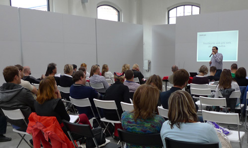
Zdeněk was the ambassador of this year's third meeting of Designer's Mixer designers, organized by BrandCloud.pro. This time, however, everything took place online. During his presentation, Zdeněk mainly showed the results of a survey on the work of designers with content, which he organized together with BrandCloud in the autumn.
Zdenek had a presentation on Marketing Day in Ostrava and in Pardubice.
We organized a conference Speech on Graphic Design in Brno and Prague and Zdeněk gave a presentation on how self-confidence in graphic design is manifested. Here is a record from Brno.
Newest blog about common mistakes in design - available only in Czech.
I’d like to invite you to my lecture in Ostrava on February 19th at Marketing Mix at the Clarion Congress Hotel Ostrava. The lecture starts at 2 p.m.
After a year you could see Zdeněk again at the stage of Marketing Mix in Prague and also in Brno. His last lecture called What should you know about graphic designer's work in case your graphic designer would not know it.
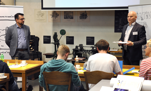
You could see Zdeněk as a guest and expert in marketing communication at introductory seminars of the Creative Hub project. Information was provided on finishing printing technology. There were two seminars, with one held at the National Monument in Vítkov, the other at the printing exhibit at the National Technical Museum. The Grafie company and its main partner Konica Minolta are responsible for the project.
Zdeněk's presentation at Marketing Mix is slowly becoming a tradition. This time, it was about presentations as well as about their painful creation. Listen to tips about which three snapshots should be in your presentation, as well as about three that should be left out. Many people came, and the feedback was very pleasant. As usual, the presentations regarding the topic could be heard in Prague, from which the recording originates, and in Brno.
Zdeněk had another presentation at Marketing Mix. It was titled “Building a Graphic Brand for Building a Genuine Brand”. It included details about how and where to present brand graphics effectively and how to use tools for such presentation. There were opportunities to view the presentation in Prague and Brno. A recording of the presentation from Marketing Mix in Prague is here.
Zdeněk again gave a presentation at Marketing Mix in Prague and in Brno. These presentations in the spring of 2016 were also given in Ostrava and Hradec Králové. Those present had the opportunity to find out how bad their logos are. The recording of the presentation comes from Marketing Mix 2017 in Brno. Please excuse the poor quality of the recording. The presentation was interrupted by noise from the neighbouring exhibit hall.
The third article about shattering misconceptions in graphic design shows that graphic design is part of a larger scope of skills. Therefore, none of our readers have the opportunity to sense that the spreader of such notions intended to share something completely different before releasing printed material.
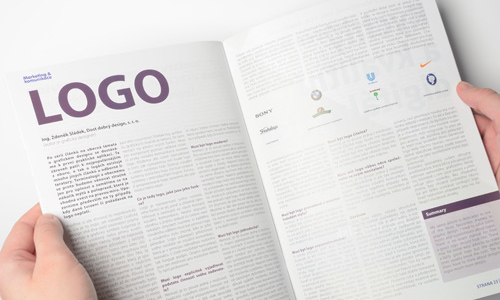
There is a new issue of the magazine published by the Česká marketingová společnost with an article written by Zdeněk entitled “Designing a Logo”. This is the final instalment of three articles devoted to the topic of logos. This time, it actually focuses on how such a logo could appear. It is said that a logo is supposed to involve an idea. I have been actively involved in the field for approximately 15 years, and I don’t know what that is. A surprising solution is usually considered such an idea.
For the third time, we are making a presentation as part of the accompanying programme of the World of Advertising trade fair hosted by Omnis Olomouc, again under the professional patronage of the Union of Graphic Design. “How to Get the Maximum from Your Graphic Designer” is the name of Zdeněk's contribution. The presentation provides a guide to deciding what to eliminate. The trade fair first took place on 28/9/2011 at the Voroněž Hotel in Brno, right next to the Brno Trade Fair and Exhibition Grounds. It then moved to Prague's Hotel Diplomat for the accompanying programme.
The second article about shattering misconceptions in graphic design shows that holding a tender is hardly as simple as may first seem. When the choice comes down to weaker designs, sometimes there isn’t enough knowledge to choose correctly.
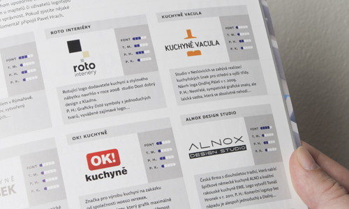
In the traditional evaluation of logos regarding a particular topic, logos of kitchen studios were evaluated this time, and our representative did not do badly at all, despite the frequently harsh critical commentary in this magazine.
The first in a planned series of shorter articles that will shatter certain entrenched misconceptions. The first is focused on the popular saying that a picture says a thousand words. However, it is necessary in particular to realise the correct sequence in that saying.
On the last day of the accompanying programme for the Reklama Polygraf advertising trade fair, the enigmatic lecturer Sven Ekstrøm made an appearance. However, this was Zdeněk Sládek in the role of the foreign designer. At the presentation on the subject of naming, he could not make an impression with his own name. That you are here is the answer to the question as to why a name is important.
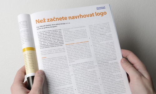
An issue of the magazine Marketing & komunikace was recently published by the Česká marketingová společnost with an article from Zdeněk. It was entitled “Before you Begin Designing a Logo”. It focuses on preparation, selection of a name and gathering information prior to the creation of a logo. It is a good idea for certain gaps to exist between the specific implementation of an entire logo and its ideological foundation to provide room for the viewer’s imagination and to capture their attention.
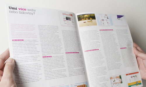
We prepared our first expert article in this magazine. The article focuses on the theme of the World of Advertising trade fair presentation from 2013 and deals with a comparison of websites and printed publications. Unlike printed materials, you do not have a clear impression of the actual scope of a website at first glance.
In issue 09/2013 you can find a brief interview with Ing. Zdeněk Sládek focused on the theme of print press marketing.
On the premises of ČSVTS (the Czech Association of Science and Technology Firms) at Novotná lavka in Prague, the Dialogue with the Customer conference was held on 23 October 2013, including a discussion panel of experts. Ing. Zdeněk Sládek was one of the panellists for the block entitled “How to Sell More to the Customer”.
A new issue of Marketing & komunikace magazine, which is published quarterly by Česká marketingová společnost, has been published. A new article in it bears the simple title “Logo”. In the article, Zdeněk attempts to shatter certain misconceptions that claim that a logo must always be this or that. Recently I encountered multiple redesigns of older Czech logos whose original artistic design corresponded to the time of their creation in the early 1990s. However, they had their own genius and a distinct character. Many of these logos have been substituted with new ones designed in a specifically modern way. However, they have lost their original charm.
Following a year-long break, the Union of Graphic Design again contributed to the accompanying programme of the Svět reklamy (World of Advertising) trade fair hosted by Omnis. One of the presentations was also given by Ing. Zdeněk Sládek. The trade fair was first held on 24/9/2011 in Brno's Wannieck Gallery, which is located in the centre of the city near the Vaňkovka shopping centre. The theme of the presentation was the comparison of the characteristics of websites and printed materials. The World of Advertising then moved with its accompanying programme and this presentation to Prague's Hotel Diplomat. The scheduled date was 1/10/2011. Although websites have countless functions, they are incapable of performing certain basic things. After all, we perceive the web visually and in a very limited manner. Sometimes even an entire page is not visible from a website. In contrast, you can perceive print material using almost all of your senses.
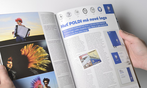
The first graphics magazine Font printed an article about our redesign of the traditional Czech brand POLDI, which was carried out this spring. An article and examples can be found on page 19.
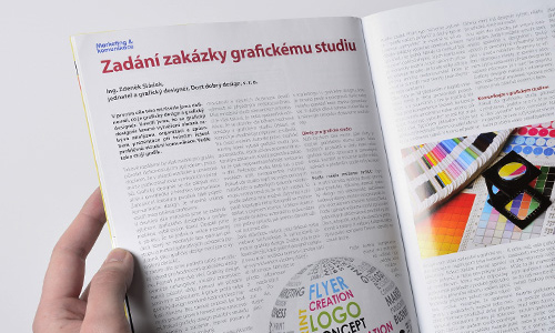
A few days ago, a new issue of Marketing & komunikace magazine was published by Česká marketingová společnost. The new article is entitled “Assignment of a Task to a Graphic Art Studio”. Besides containing a few tips for preparing documentation, it also focuses on the difference between tasks that require following instructions and types that give designers a free hand in being creative. When purchasing a vehicle, camera or whole set of products, it is obviously necessary to know as much as possible about the product being purchased. It is important to know how it works, how it was produced, what its parameters are, etc. If services are assigned to a graphic design studio, the same applies, even if this is not apparent at first glance. Your maximum level of awareness about your own experience will enable you to avoid potential misunderstandings.
In issue 12/2012 you can find a brief interview with Ing. Zdeněk Sládek regarding typography across media.
At the 26th UGD seminar held in June, an attempt was made to highlight the key moments of communication with clients. For this demonstration, Zdeněk Sládek selected a commission for the creation of the brand and the introductory campaign for Z GRUNTU. The seminar was held at HUB Prague on June 11th, beginning at 7 p.m. The purpose of this practical seminar was to explain that “people from marketing” on the client's side are not enemies. We graphic designers must explain our work to “those people from marketing” and clarify “why”, “what” and “how” we are doing. We must also listen to their needs and know how to offer even better solutions than they could ever have imagined. The video from the seminar can be found on youtube.com. The burden of responsibility for communication and explanation rests on the shoulders of graphic designers as suppliers. Therefore, please let the client know the right things at the right time. To start with, be sure to explain the entire process to them.
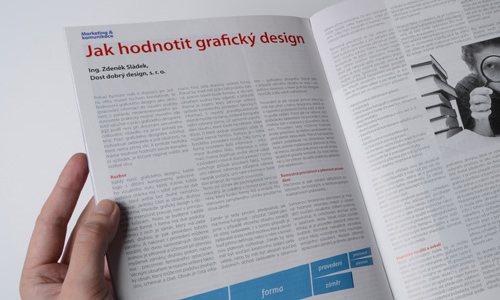
At the end of September, another edition of Marketing & komunikace magazine will be published by the Česká marketingová společnost for its members and the wider professional public. The new issue contains the third instalment of our series on graphic design. The newest article is entitled “How to Recognise Good Design”. It is good to realise that graphic design can neither fail to function nor fail to have an effect. However, graphic design can very easily have an entirely different impact than originally intended.
In issue 6/2012 you can find a brief interview with Ing. Zdeněk Sládek focused on the promotion of printing presses.
The publication Noviny pro grafický průmysl brings an interview with Ing. Zdeněk Sládek regarding the present and future of the market.
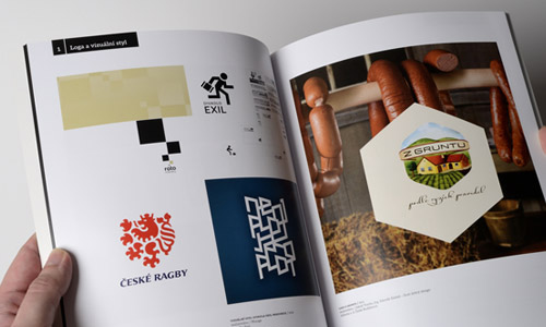
Many of our work tasks are presented in the pages of the first yearbook of the Union of Graphic Design. The Z GRUNTU and the ROTO logos are both visible in the image. A total of 1,500 copies of the yearbook have been printed. The yearbook was also published to mark the occasion of the booth at the Reklama/polygraf advertising trade fair in Prague Holešovice, which we visited briefly.
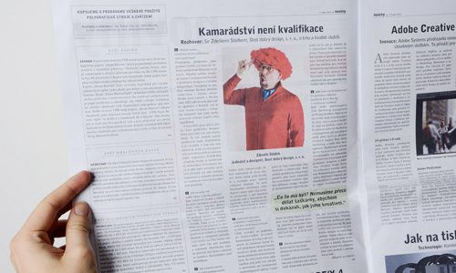
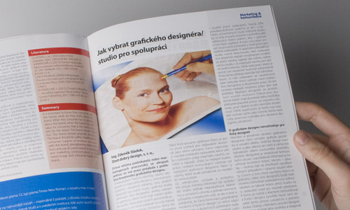
The magazine of the Česká marketingová společnost has published more from the series of articles on how to select a graphic designer/studio for cooperation. The author of the article is Ing. Zdeněk Sládek. The article has been through approval processes of the editorial board chaired by Professor Gustav Tomek. You can find it on page 25 in issue 1/2012. It may seem that graphic artists and graphic designers make decisions regarding the level the resulting graphic design will have. This is not entirely true. The decisions regarding improvement lie more in the hands of enlightened and well-informed clients.
Under the auspices of the Union of Graphic Design, at one of the presentations of the accompanying programme of the trade fair Svět reklamy (World of Advertising), a presentation was also given by Ing. Zdeněk Sládek. The trade fair was held on 20/9/2011 at the Voroněž Congress Hall in Brno, which you can find just a few steps from the Brno Trade Fair Grounds. The most common typographical errors were the theme of the presentation. With its accompanying programme and this presentation, the World of Advertising then shifted to the Hotel Diplomat in Prague, where it celebrated perhaps even greater success than the first presentation in Brno. The event took place on 4/10/2011 at 11:40 a.m. Many typographic errors involve spaces, either too many or too few. Besides formal accuracy, the proper use of spaces also has an effect on the message being conveyed.
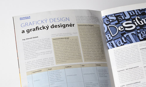
The magazine of the marketing firm Česká marketingová společnost printed our article entitled “Graphic Design and the Graphic Designer”, the aim of which was to familiarise all marketers with the profession of graphic (communication) designer. The author of the article is Ing. Zdeněk Sládek. The article has been through the approval processes of the editorial board chaired by Professor Gustav Tomek. You can find it on page 14 in issue 3/2011. English dictionaries translate the word “design” as “projektovat, plánovat, koncipovat, zamýšlet”. In engineering, the Czech verb “konstruovat” also uses the same English equivalent. In all cases, these are terms with very rational content describing the analytical and subsequent creative activity, which is the actual basis of the activities of a graphic and communication designer. Therefore, graphic design is not merely the creation of images.
Discussions on this Czech Radio station focused on the popularisation of science, and in addition to UGD Chairman Ing. Milan Sládek from the Dost dobrý design studio, two other founding members of the Union of Graphic Design, specifically Filip Blažek and Jan Tippman, also participated.
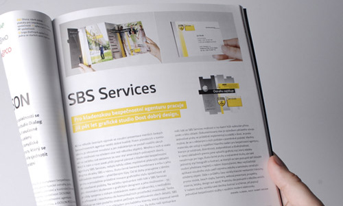
We would like to thank the editors of the first issue of the graphics magazine Font for publishing our comprehensive work for the Kladno-based agency SBS Services under the topic of their September edition – security services. An example with text can be found on page 35.
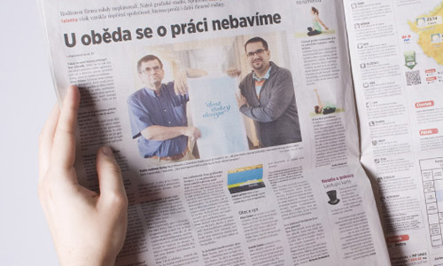
On Friday, 12 August 2011, we provided Mladá fronta with an interview, and today it was published! The Summer insert with a series about family firms in section B included an interview with Zdeněk and Milan Sládek.
Before last Christmas, an article was published on the Hospodářské noviny newspaper website about printed and electronic New Year's cards. Zdeněk Sládek answered a few questions.
We have published a practical guide in the form of a laminated card in A5 format with an overview of the most basic typographic rules for daily use in the office. If you are interested in this guide, please contact us. Our mother tongue also includes rules for writing various symbols. We present an overview of the most basic ones for you. Unfortunately, professionals involved in text processing also played a major role in violating standards.
At the request of Mr Eduard Zeman, Zdeněk wrote a brief article for logobox.cz about why logos should be utilised at all. It is necessary to refute the misconception that having a good logo (and/or visual identity) is important because it is beautiful. That is not true. Having a good logo is important because such a logo will help find more customers for your product and will give you the opportunity to charge a higher price for it.
A few day ago, the HRaNA studio published a book mapping Czech logos from 1989 to 2008. It also includes our logos for Zóna shoes, the Naven store and a logo for the Beznoska company that was never used.
We were mentioned in an article at podnikatel.cz. We answered a couple of questions from the editorial board about the modern approach to logotypes.
On stage at the Austrian Cultural Forum in Prague, Zdeněk shares details about his experience with design among small and medium-sized enterprises at the EWDS international workshop on support for design.